

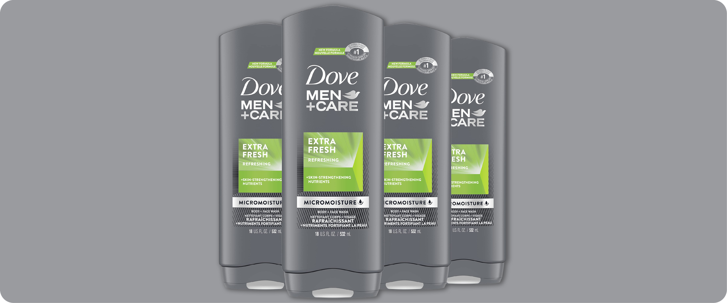
Dove Men+Care Packaging
In the years before print-ability™ existed as its own studio, we handled nearly all of Dove's packaging production through Force Majeure (formerly Raison Pure). Body wash, soap, the full range. When Dove Men+Care, Unilever's men's grooming line, launched, it became something bigger: a full brand launch and rollout across North America and global units, from first comps to final mechanicals. Of all the Dove work, this was the one worth telling.
A men's grooming line doesn't live in one format. It lives in body wash bottles, soap bars, shaving creams, and deodorants in both stick and aerosol. Hundreds of SKUs across a range of substrates and print processes, each with its own way of taking ink and holding color. The challenge wasn't any single package. It was making all of them look like one brand.
That's a production problem before it's a design one. We managed the mechanicals and extensive comping across the entire range, holding the line on consistency where the materials themselves fought it. A flexible film tube, a printed carton, and an aerosol can don't render color or detail the same way, and the shelf doesn't care about the excuse.
The Dove Men+Care design used a tone-on-tone treatment: subtle, sophisticated, and a genuine production challenge. Low-contrast, tone-on-tone detail is where inconsistency shows up first. Shift the registration, change the substrate, move to a different print process, and the effect flattens or drifts. Holding that subtlety crisp and consistent across every format and material took a keen eye and a deliberate production approach, SKU by SKU.
This work, at this scale and across this many formats, proved something. Brands needed a production partner built to be genuinely flexible and highly functional across every substrate and format a launch could throw at it. The concept behind print-ability™ wasn't invented in a vacuum. Work like Dove Men+Care is what showed it was needed, and that it would work.