Barbara's Cereal Rebrand
Complete Brand Refresh: From Design Through Production for a Leading Natural Cereal Brand
The Challenge
When Weetabix identified sales plateaus in their popular Barbara's cereal line, they launched a comprehensive brand refresh to revitalize the product and recapture market share. This wasn't a subtle update—it was a complete packaging redesign from the ground up: new logo, all-new photography focused on flavor appeal, and a natural aesthetic that reinforced Barbara's position as a healthier alternative to traditional mass-market cereals.
The signature Puffins line—the brand's most popular offering, appealing to both kids and health-conscious parents—would lead the rebrand. Creative director Nancy Hourihan of Red Relish Creative developed a bold new concept: make the Puffin mascot and the cereal itself the heroes of the package. A rigorous photoshoot ensued, with cereal in spoons and bowls becoming the main visual focal point.
Our Role in CPG Packaging Production
Once the core design concept was finalized, print-ability™ took the reins on packaging production. Our role: translate the approved creative vision into production-ready mechanicals for the entire Barbara's portfolio—managing line extensions across multiple flavors, SKU variations, and packaging formats.
This is where print-ability™ thrives. While deeply grounded in visual communication, our hallmark is exacting precision and technical mastery—critical for CPG packaging production where every detail matters and consistency across dozens of SKUs is non-negotiable.
The Production Process
The Barbara's project was an exercise in mastering compositional elements and substrate requirements. Each hero image—spoons and bowls of cereal—needed to be composited onto the final master wood-grain background to ensure absolute consistency across all SKUs. This required meticulous attention to lighting, shadow placement, and color matching.
We conducted multiple pre-production calls with the printer to address a critical technical factor: the project would use Extended Gamut printing, a seven-color process that expands the printable color range beyond traditional CMYK. This meant making strategic decisions about color hierarchy, ensuring the hero cereal imagery, natural ingredients, and brand elements all reproduced accurately on flexible film substrates.
Our deliverables included:
- Final mechanical artwork for the complete Puffins line and additional Barbara's SKU variants
- Color-managed files optimized for Extended Gamut printing
- Dieline management and structural packaging specifications
- Proofing coordination and printer liaison throughout production
The Outcome
The Barbara's rebrand was a resounding success. Sales increased substantially following the launch, validating the strategic redesign and meticulous production execution. The revitalized brand contributed significantly to Weetabix's valuation when the company was acquired by Post Consumer Products in a major transaction.
This project exemplifies print-ability™'s core strength: bridging the gap between creative vision and flawless production execution. When a CPG brand refresh requires technical precision, substrate expertise, and the ability to manage complex multi-SKU rollouts—we deliver.
Ready to bring the same level of production excellence to your packaging? Contact us or explore our portfolio and other case studies.
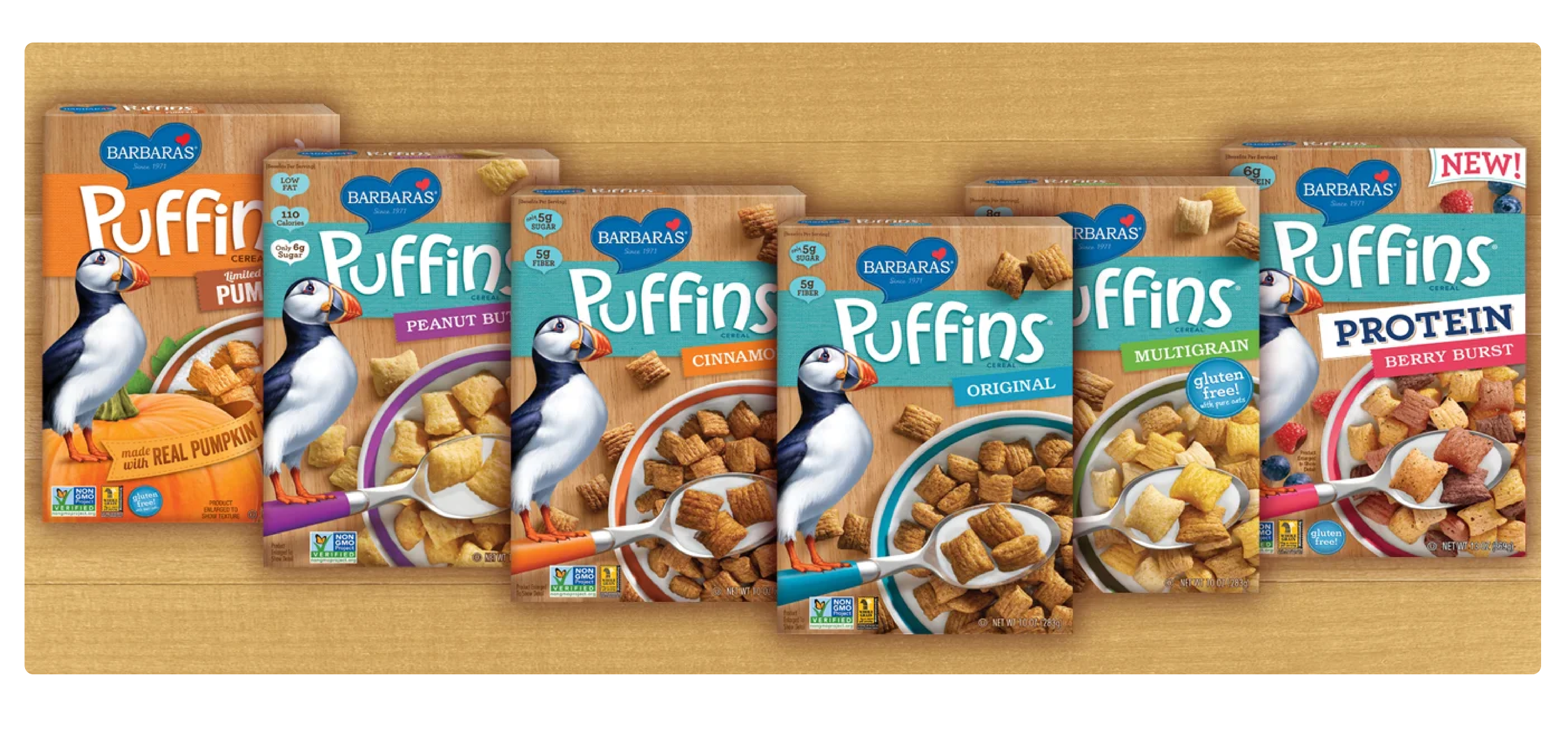
Barbara's Puffins cereal packaging rebrand — CPG packaging production and final artwork by print-ability™